


Project info.
This project didn't begin with an aesthetic question. It began with a constraint: the printing cost and time required for large-format posters were real factors that couldn't be ignored. That made the problem clear — how to achieve the same impact, or better, with fewer resources.
The answer came from the street.
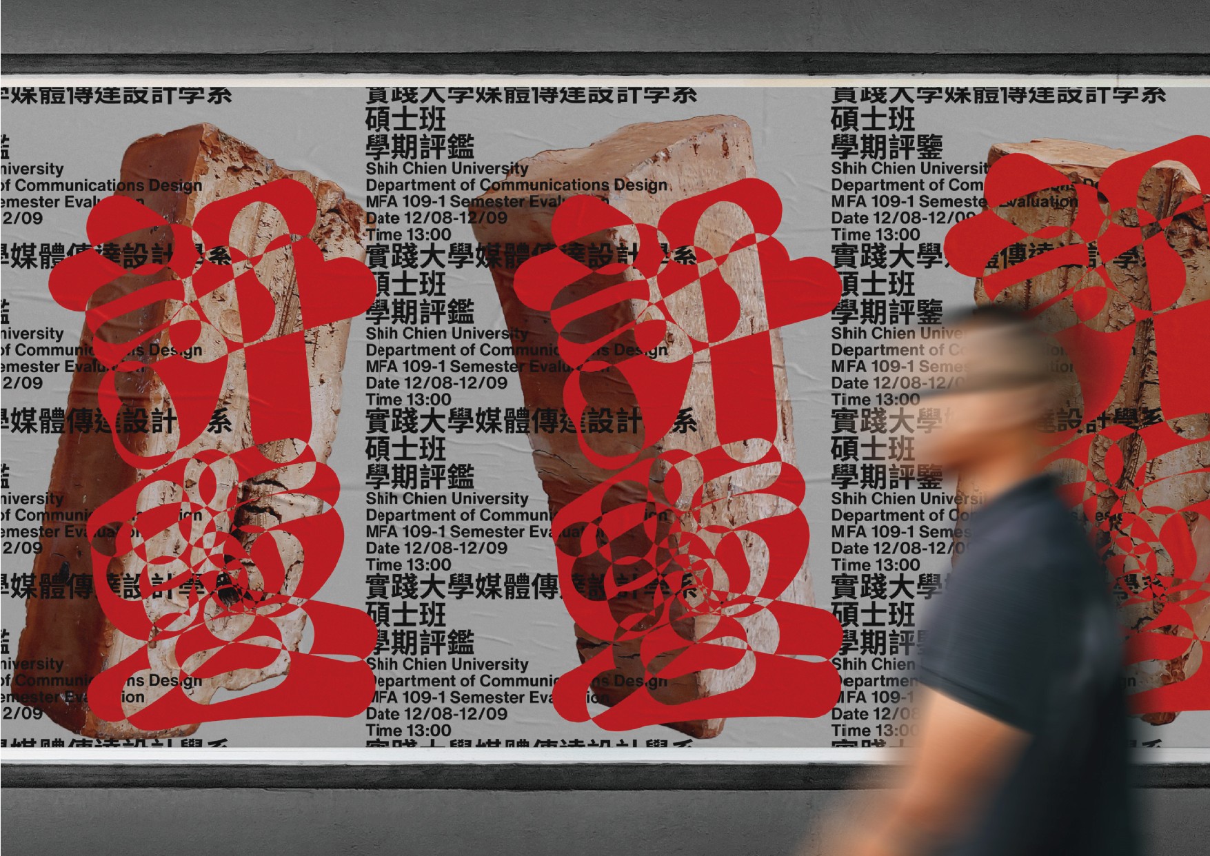
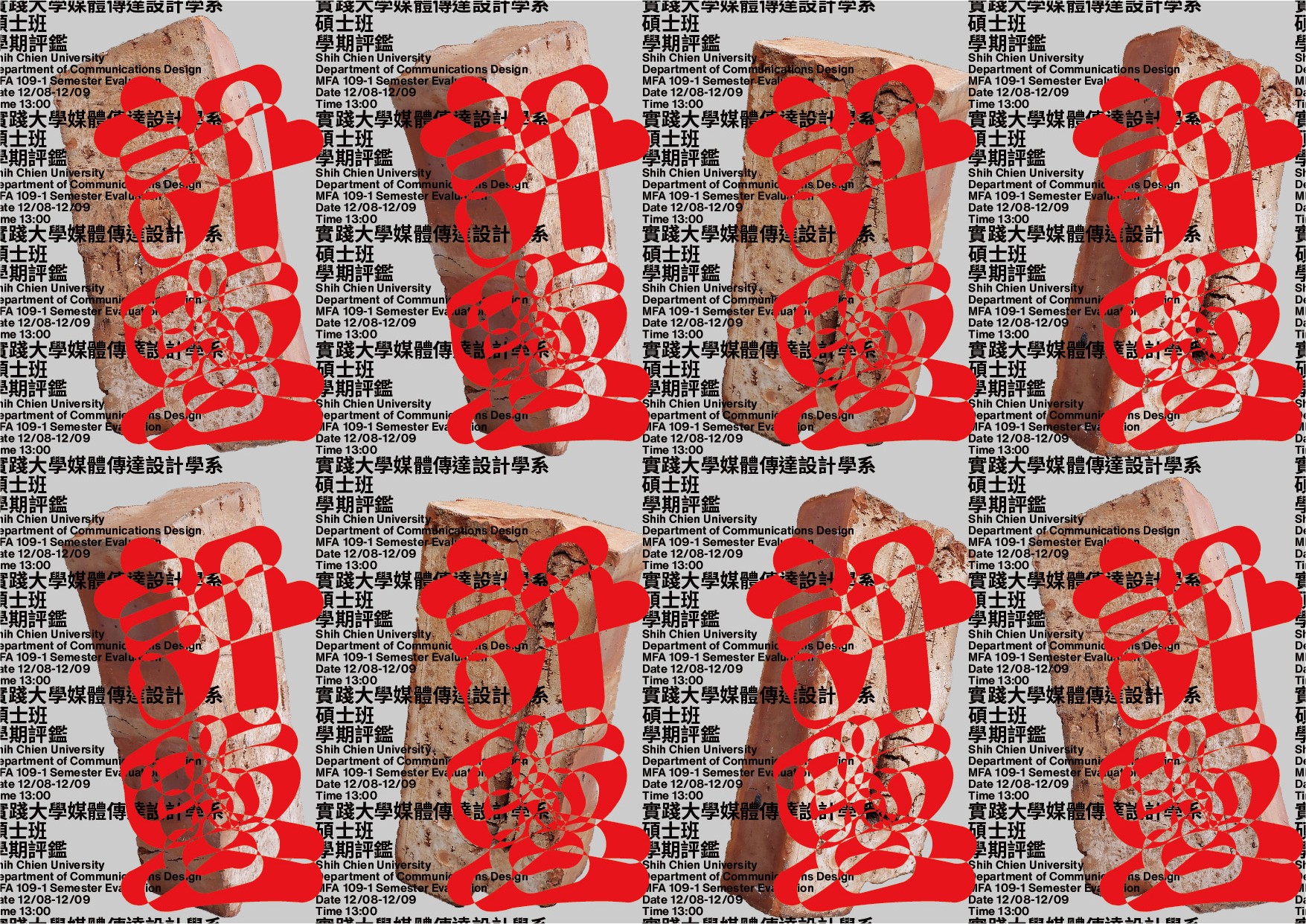
Guerrilla advertising never relies on a single large image. It works through repetition, accumulation, and spread. We borrowed that logic, building a grid-based visual structure from repeating graphic elements and typographic patterns. Each A4 or A3 poster becomes one component of a larger whole — complete on its own, but part of something much bigger when assembled. Print scale is determined by need. Reach is determined by quantity. Cost stays manageable throughout.
The brick — the department's symbolic object — was introduced as the central visual unit. Each brick appears in different positions and combinations across the poster components, giving every piece its own character while keeping them fluent within the same visual language. The brick's inherent meaning is activated in the process: it is a unit of construction, a basic element of structure. It mirrors exactly how this poster system works.
The motion version carries the same thinking further. All visual elements are free to migrate across the frame, and the edges of the composition are deliberately broken — signaling to the viewer that what they're seeing doesn't end at the border. It's still growing.
This is not a design that made compromises under constraint. The constraint became the generative logic of the entire system.