Project info.
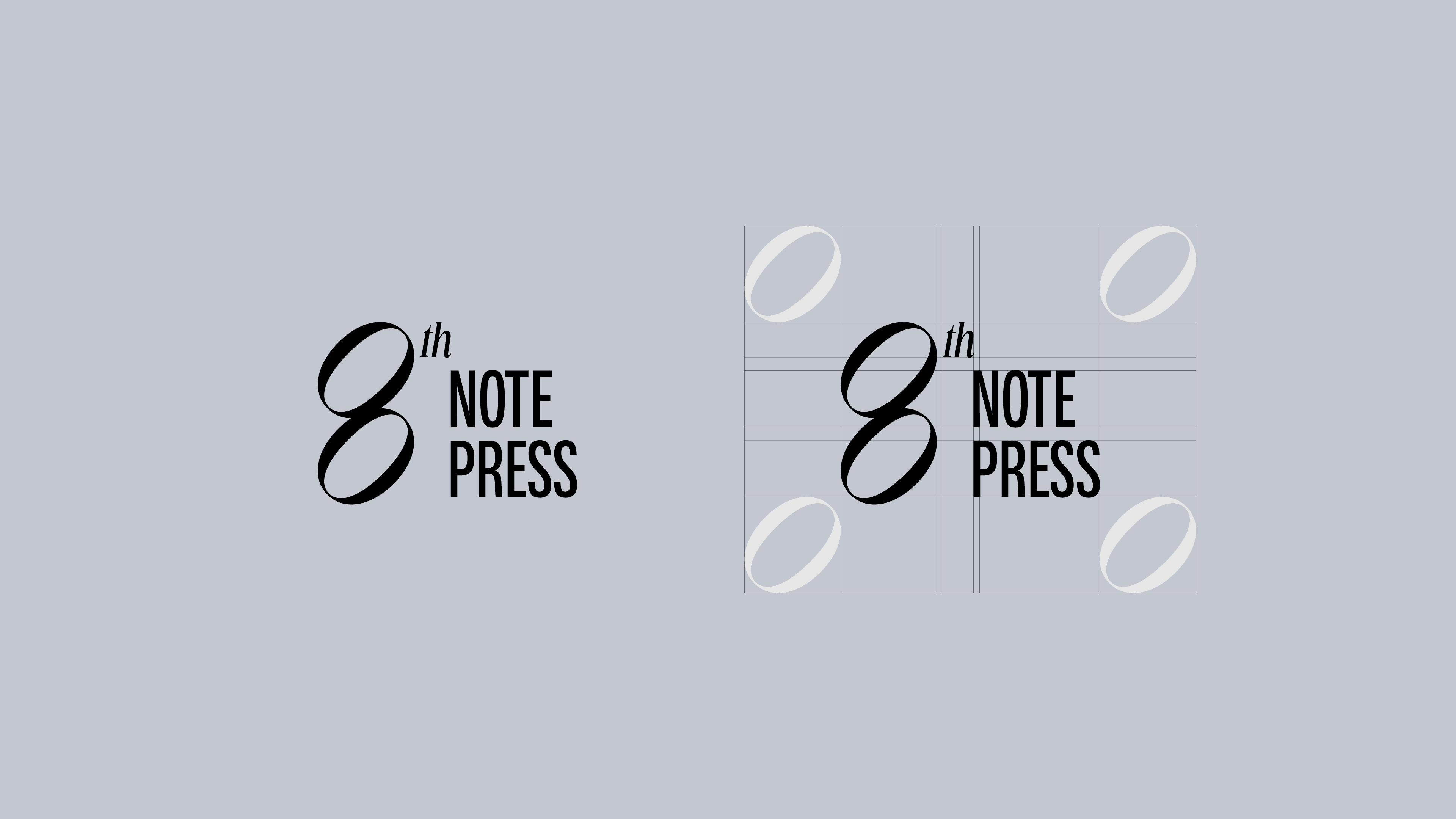
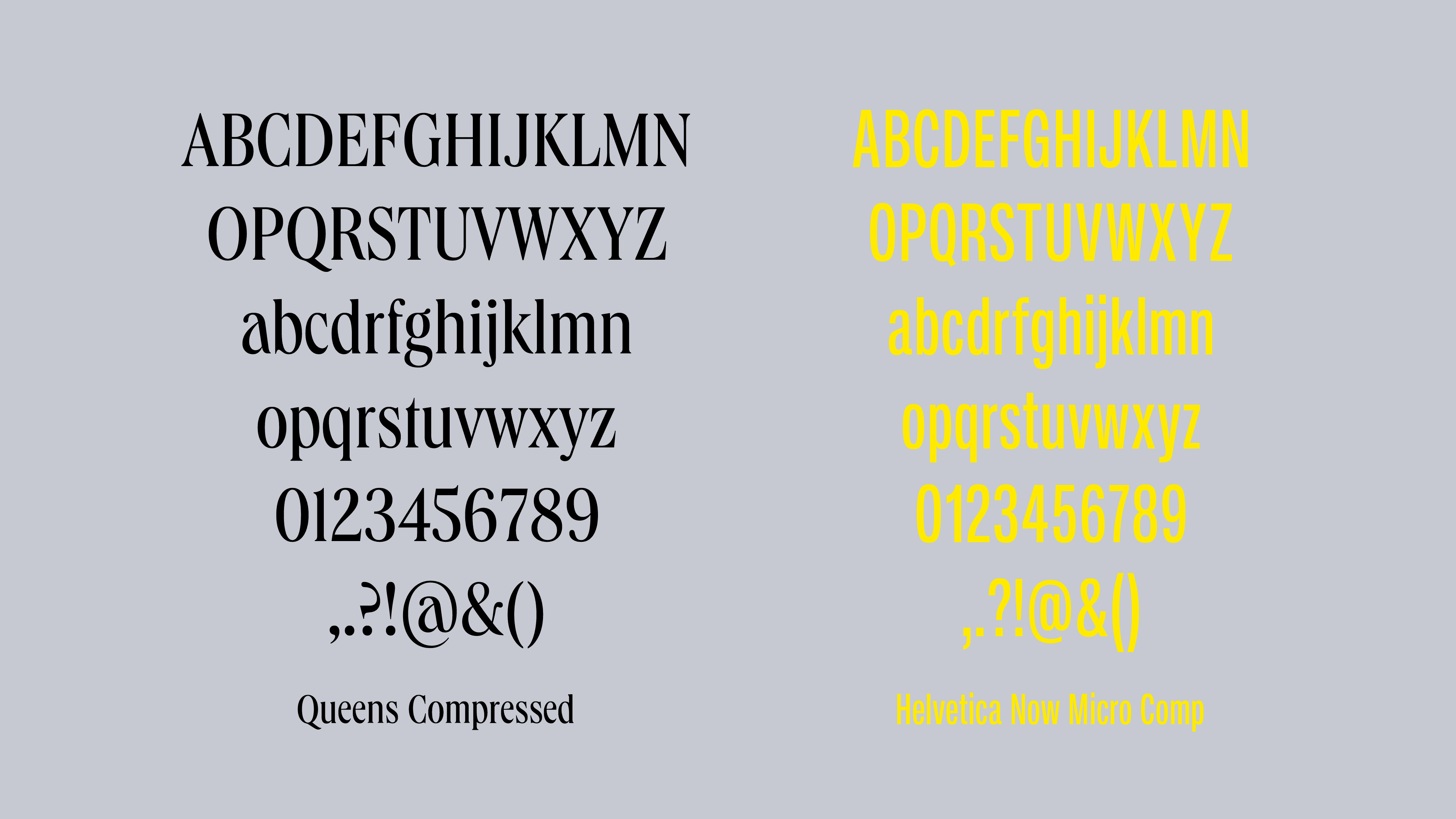
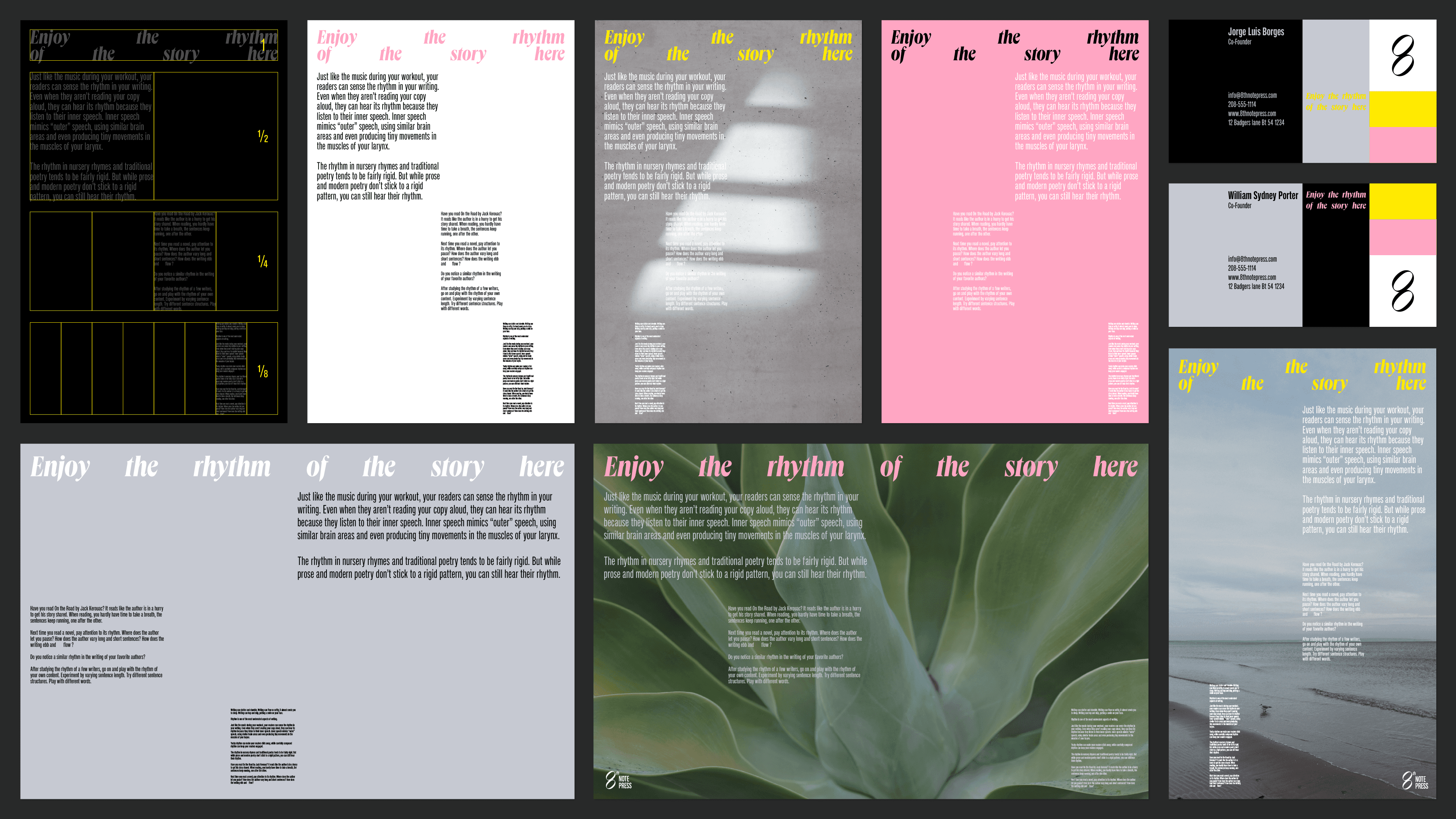
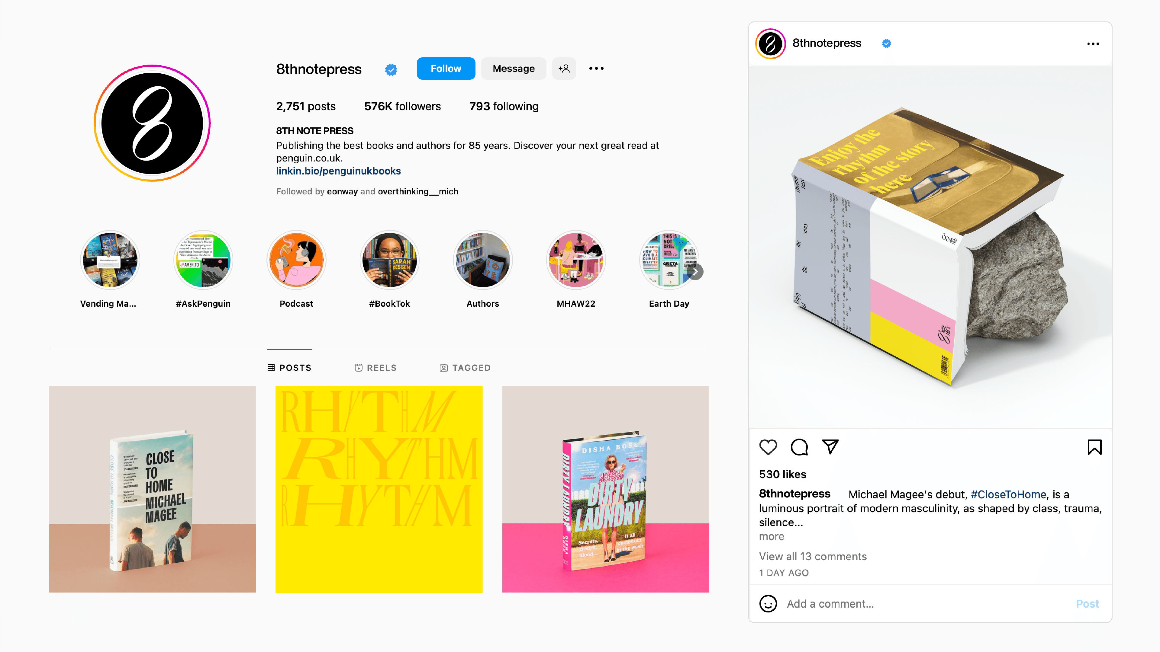
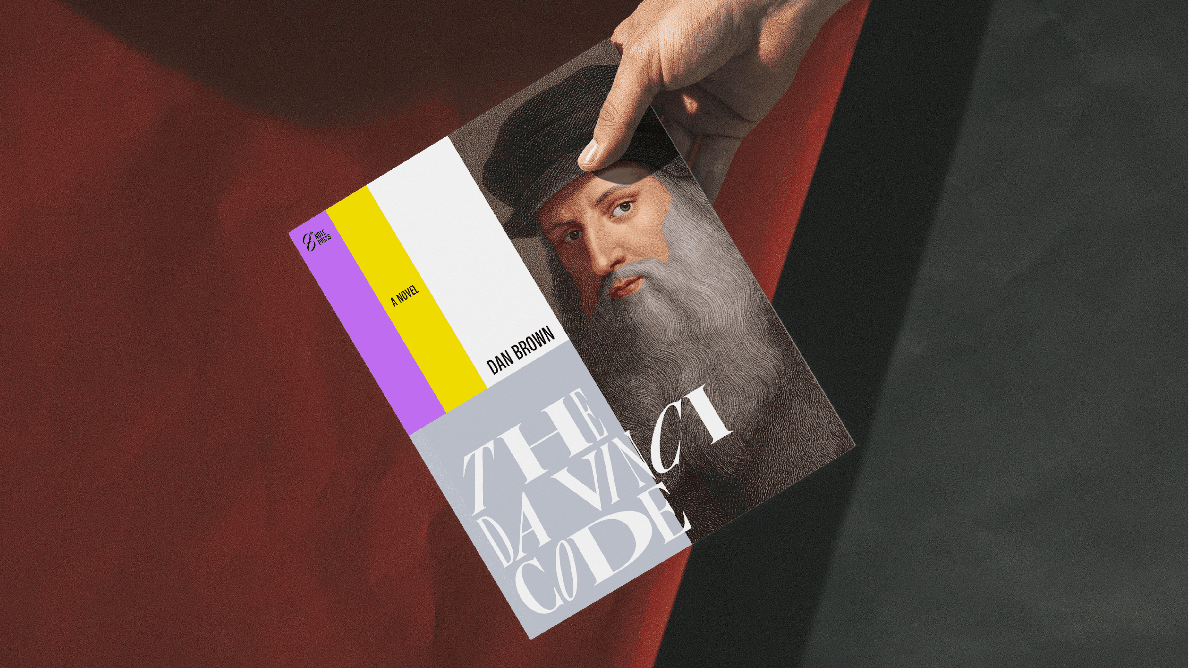
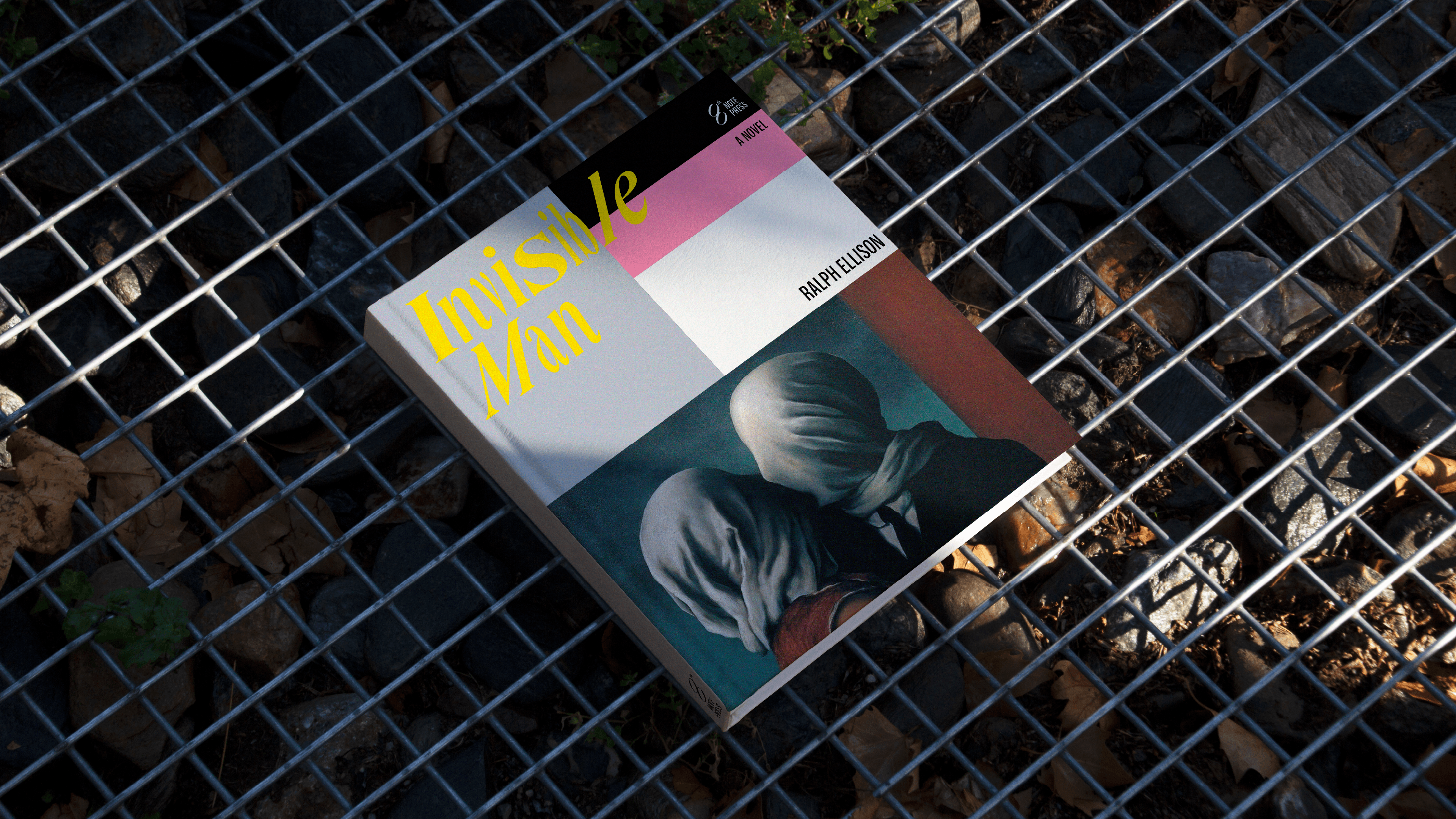
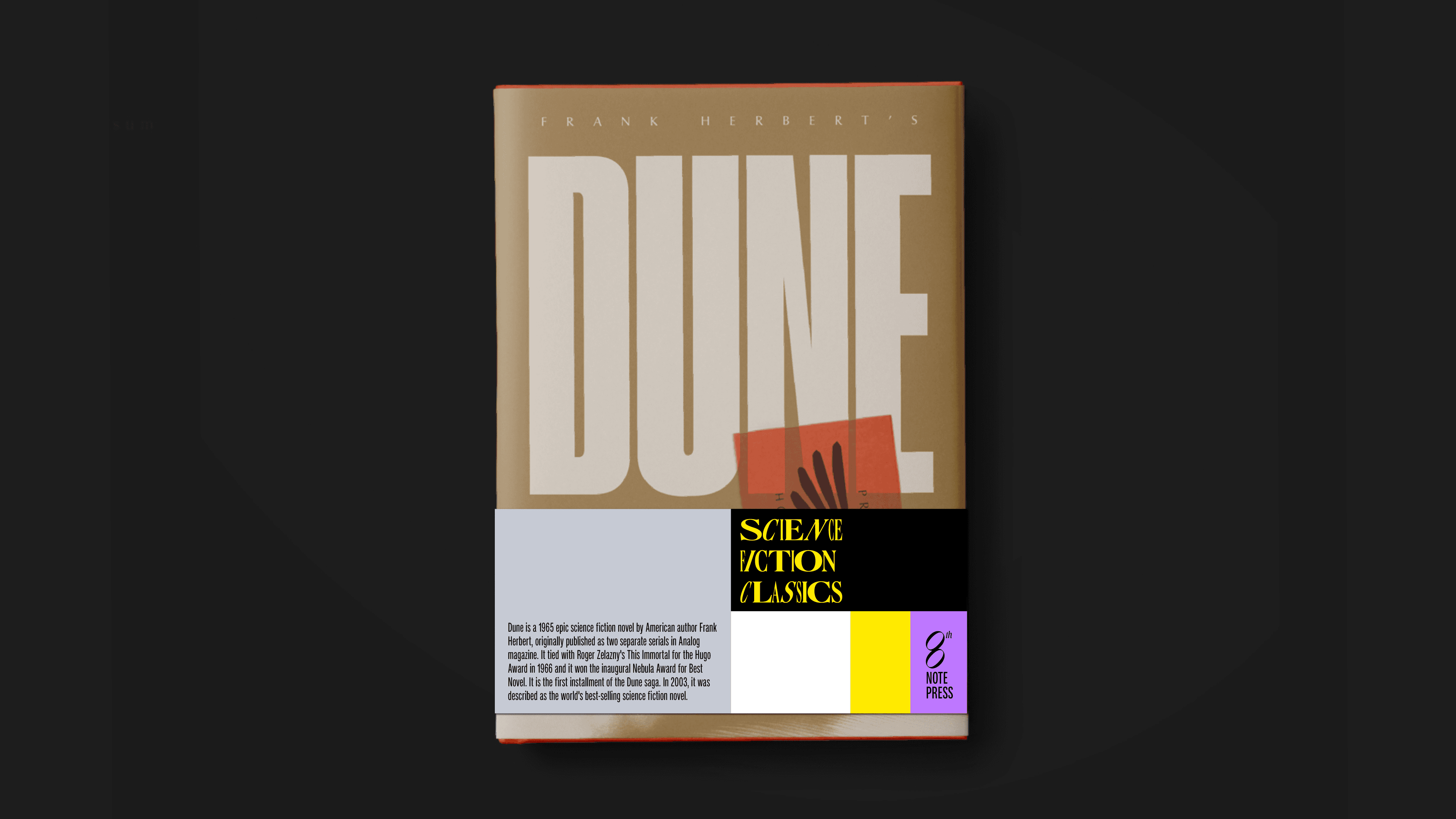
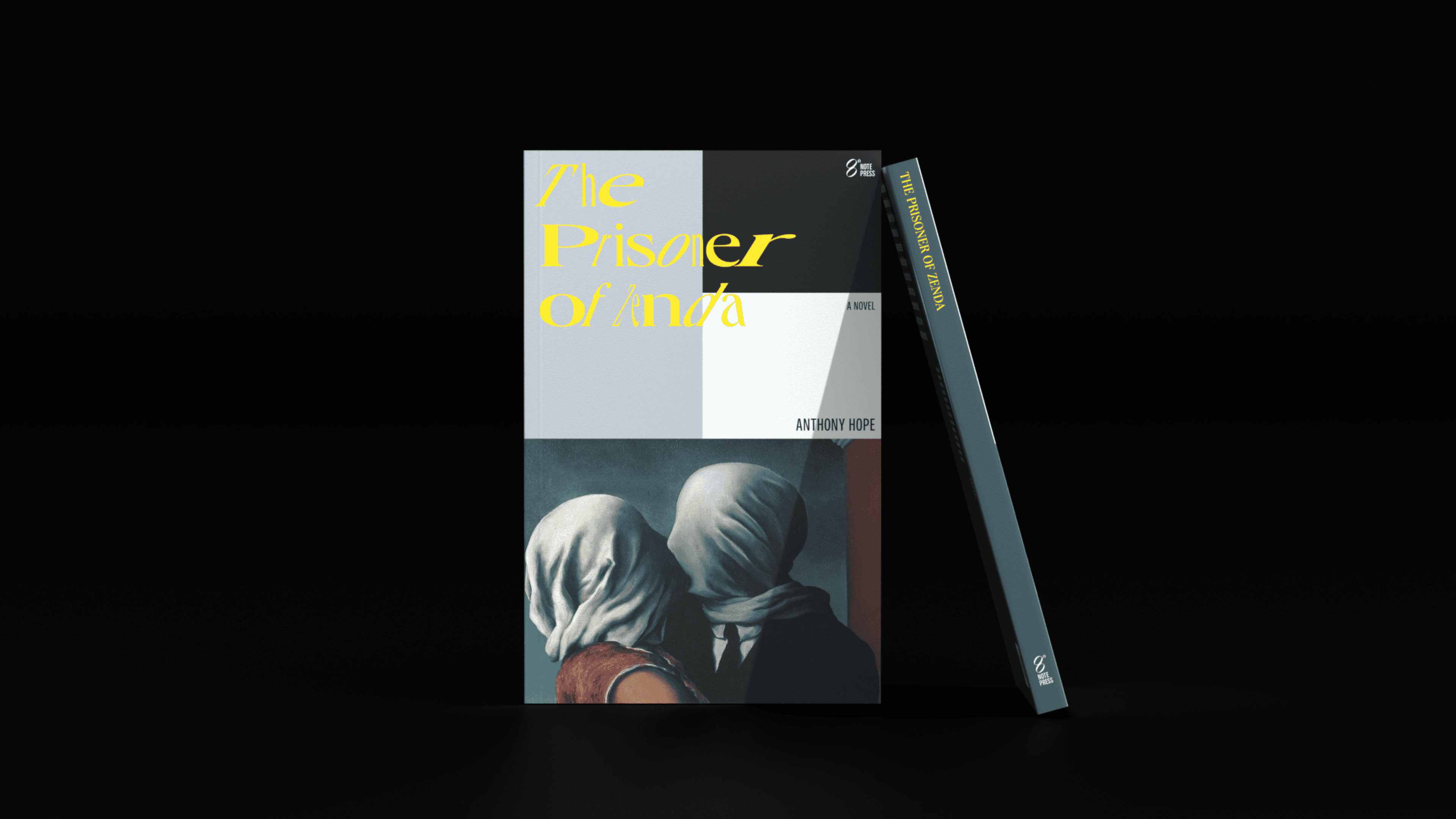
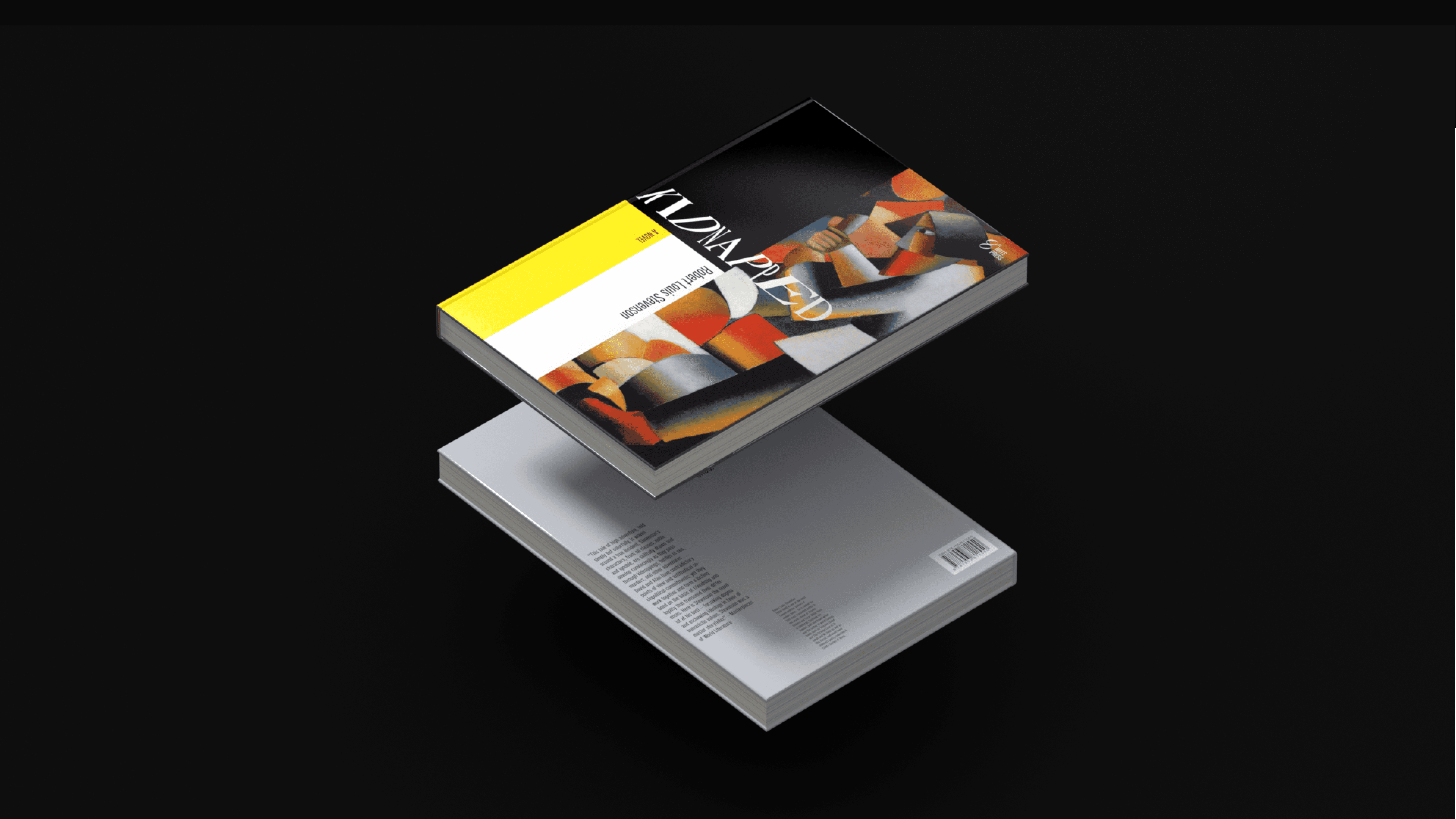
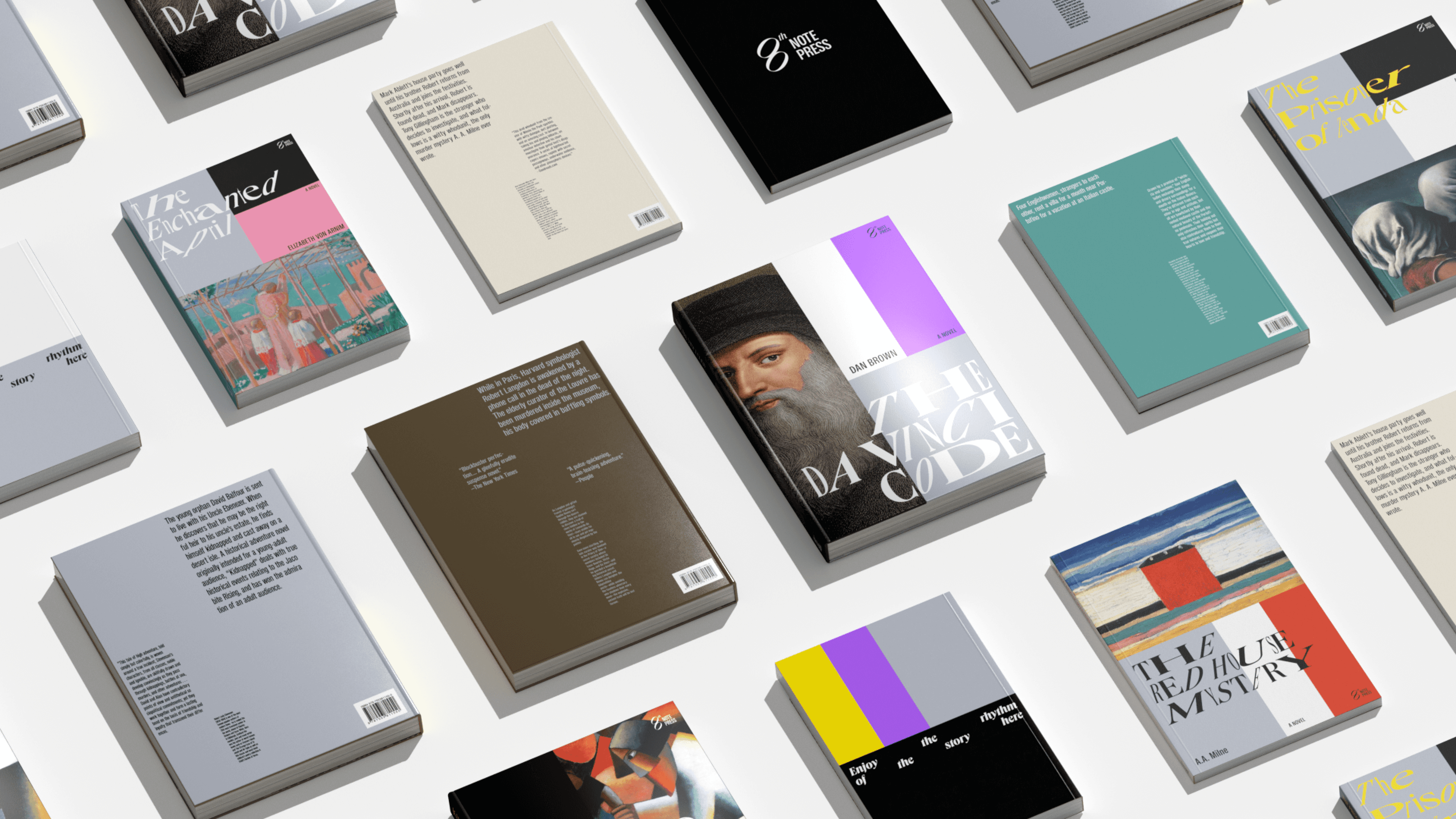
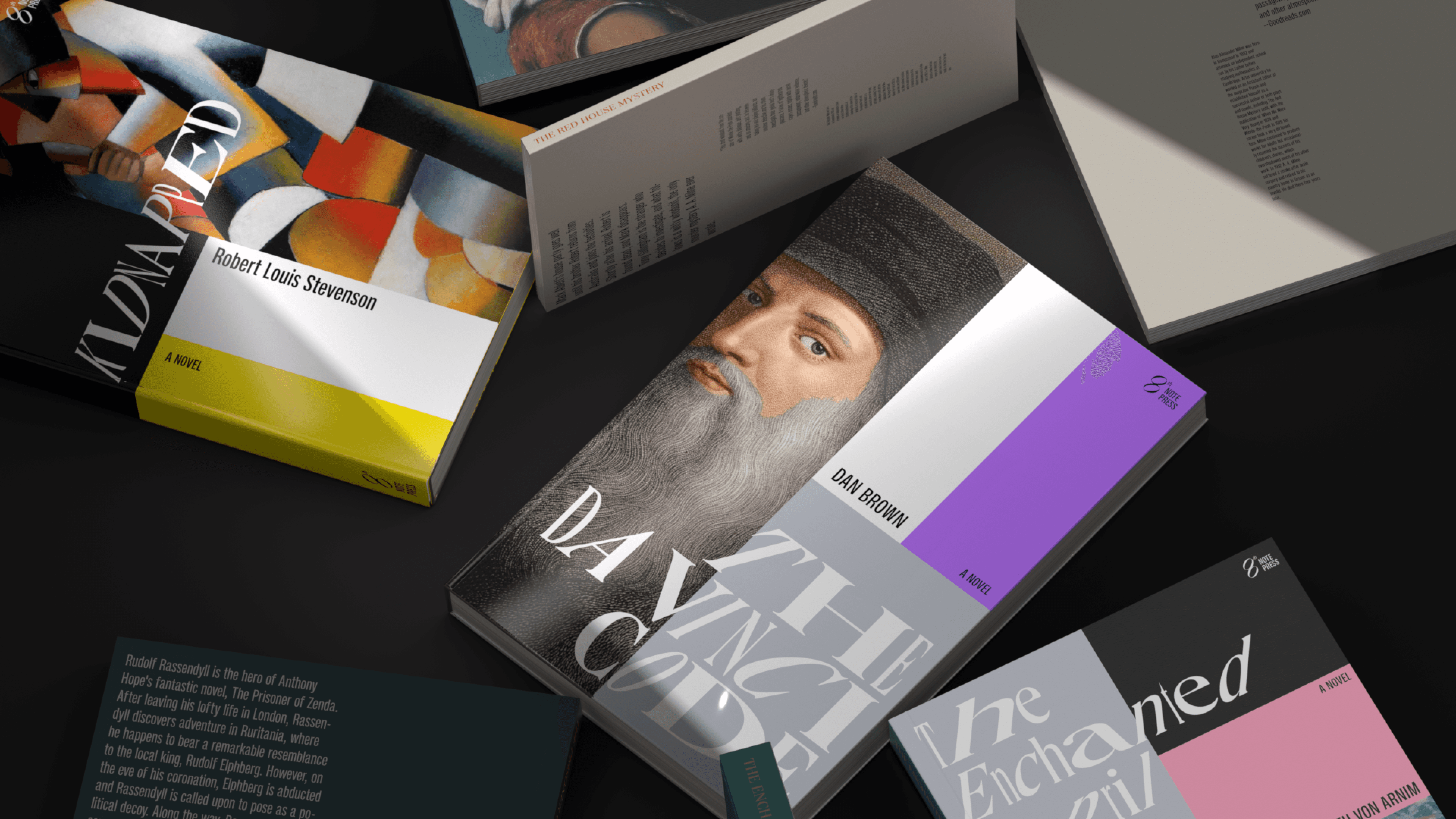
8th Note Press is a publishing brand built for international markets. arbbra developed its complete visual identity, covering the logo system, color language, typographic structure, and brand applications.
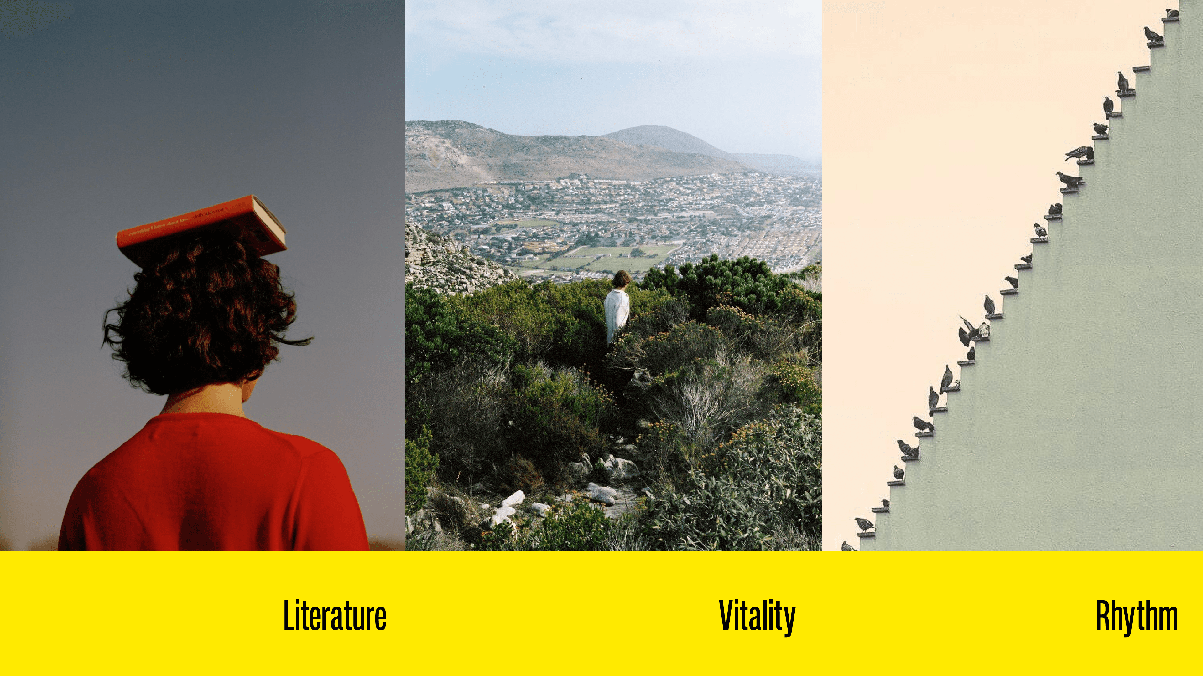
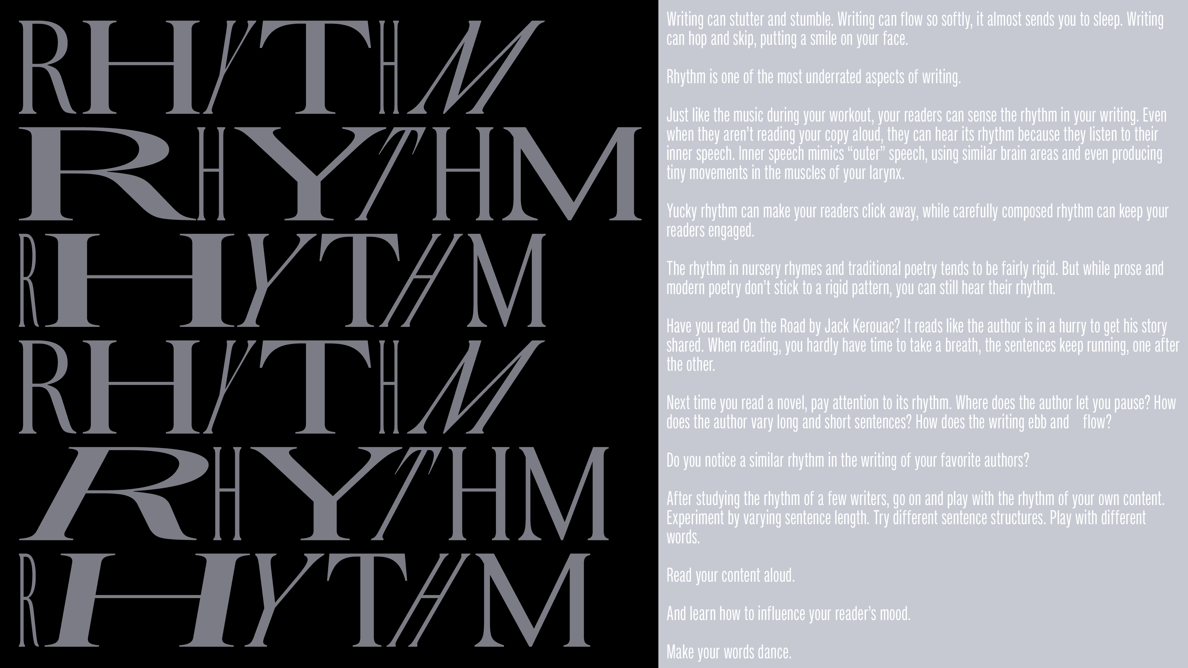
Publishing and music appear to be separate things. But rhythm is their shared foundation — words have rhythm, stories have rhythm, and good typography has rhythm too.
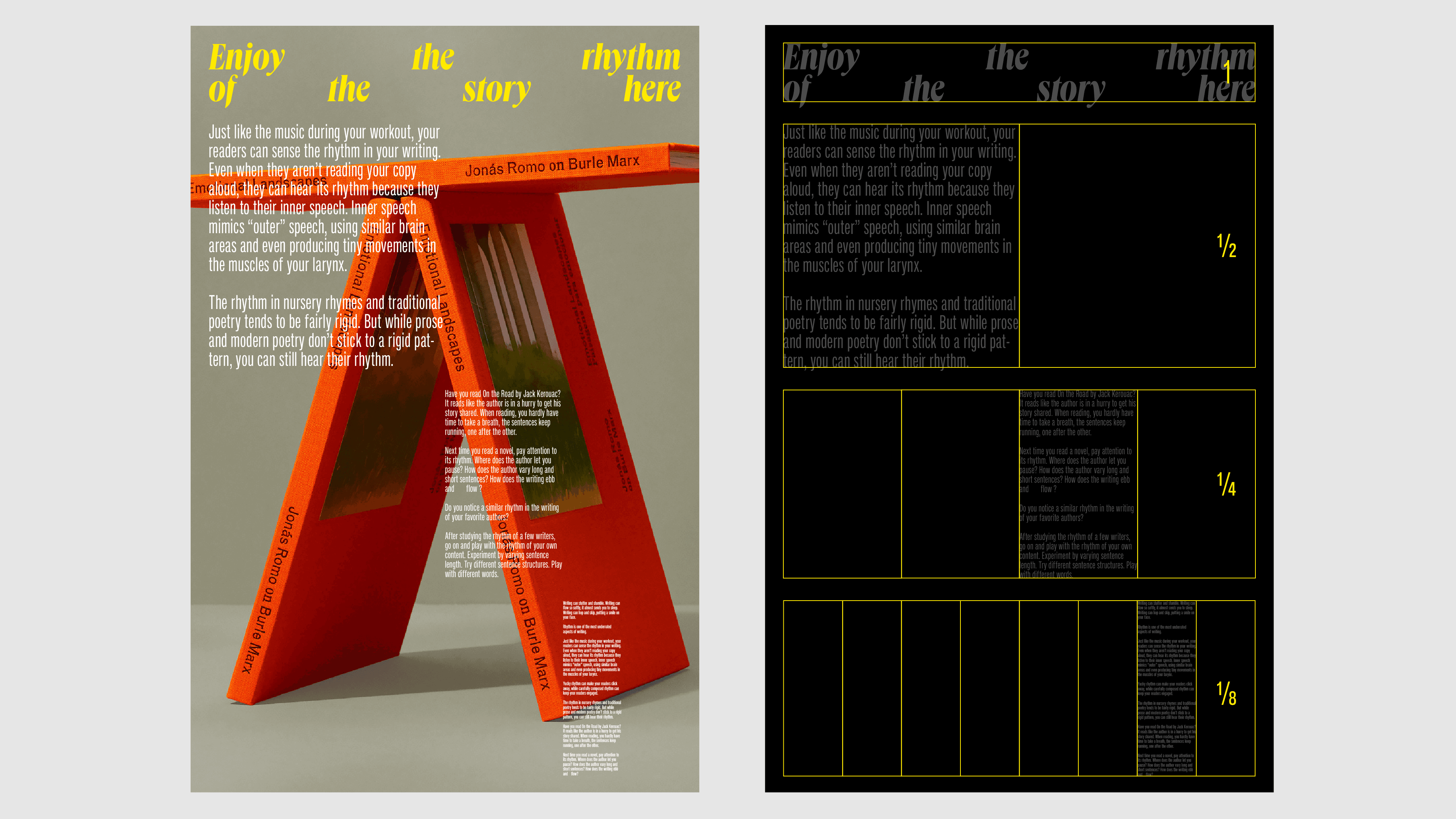
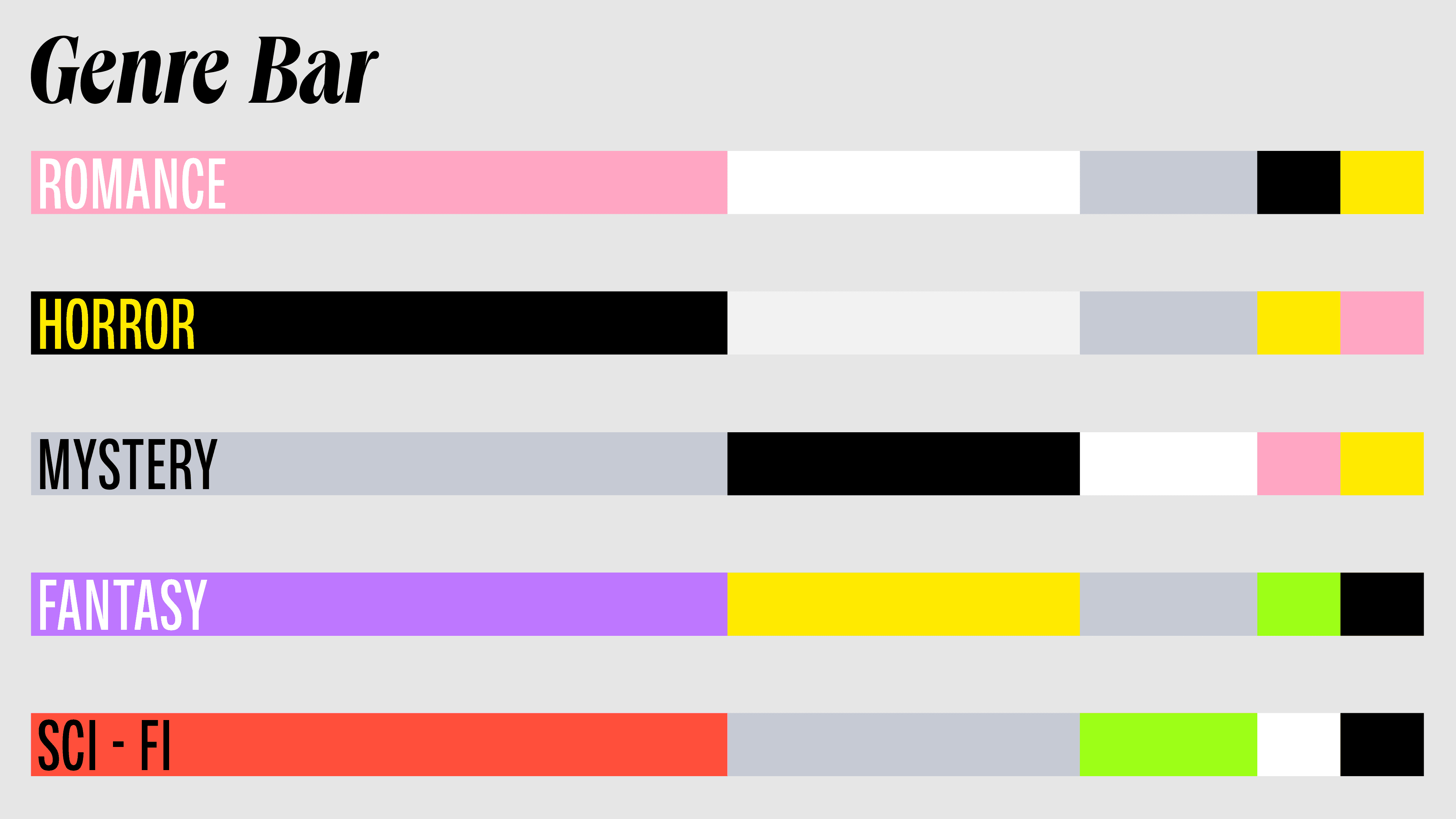
The eighth note is the brand's namesake and the generative unit of the entire visual system. One-eighth is the base model: color is distributed within it, layouts grow from it, and every structural relationship in the system traces back to this single proportion before expanding outward. This is not a decorative concept. It is a working design grammar.
Introducing the one-eighth module into the typographic system creates compositional flexibility without sacrificing order. A page can be divided, recombined, and offset — producing rich variation within a consistent set of proportional relationships. Like a musical phrase: the same notes, different rhythms, a new arrangement every time. This gives the brand both a strong, consistent identity and the adaptability to meet different content and contexts on their own terms.
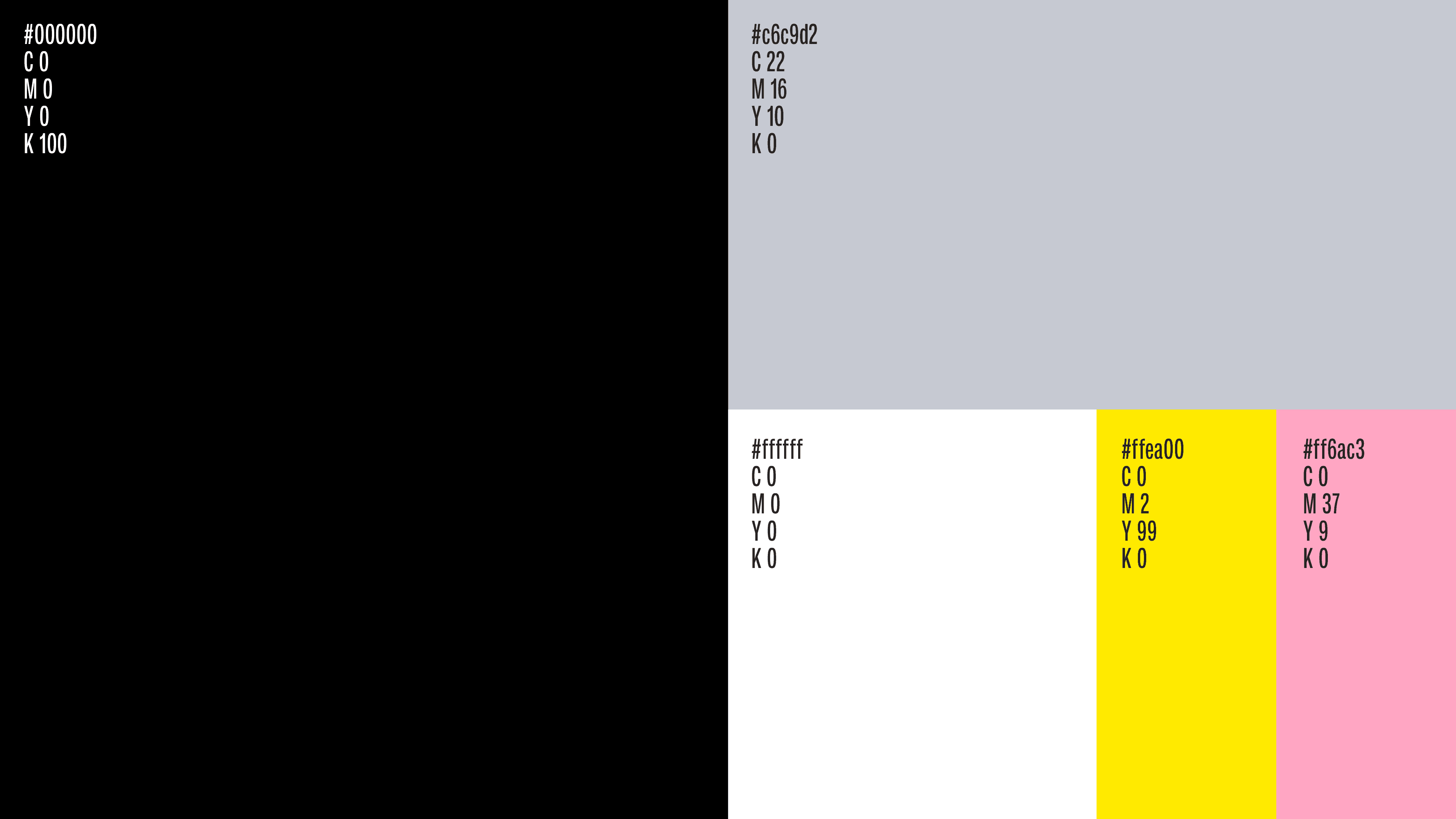
Color distribution follows the same logic. Proportion governs weight and hierarchy rather than intuitive pairing. The result is a visual system with an inherent mathematical quality — precise and restrained, but never cold.
A story needs rhythm to be felt. This brand identity is designed to keep the beat.